
Branding: logo, accent colour and the black-or-white case
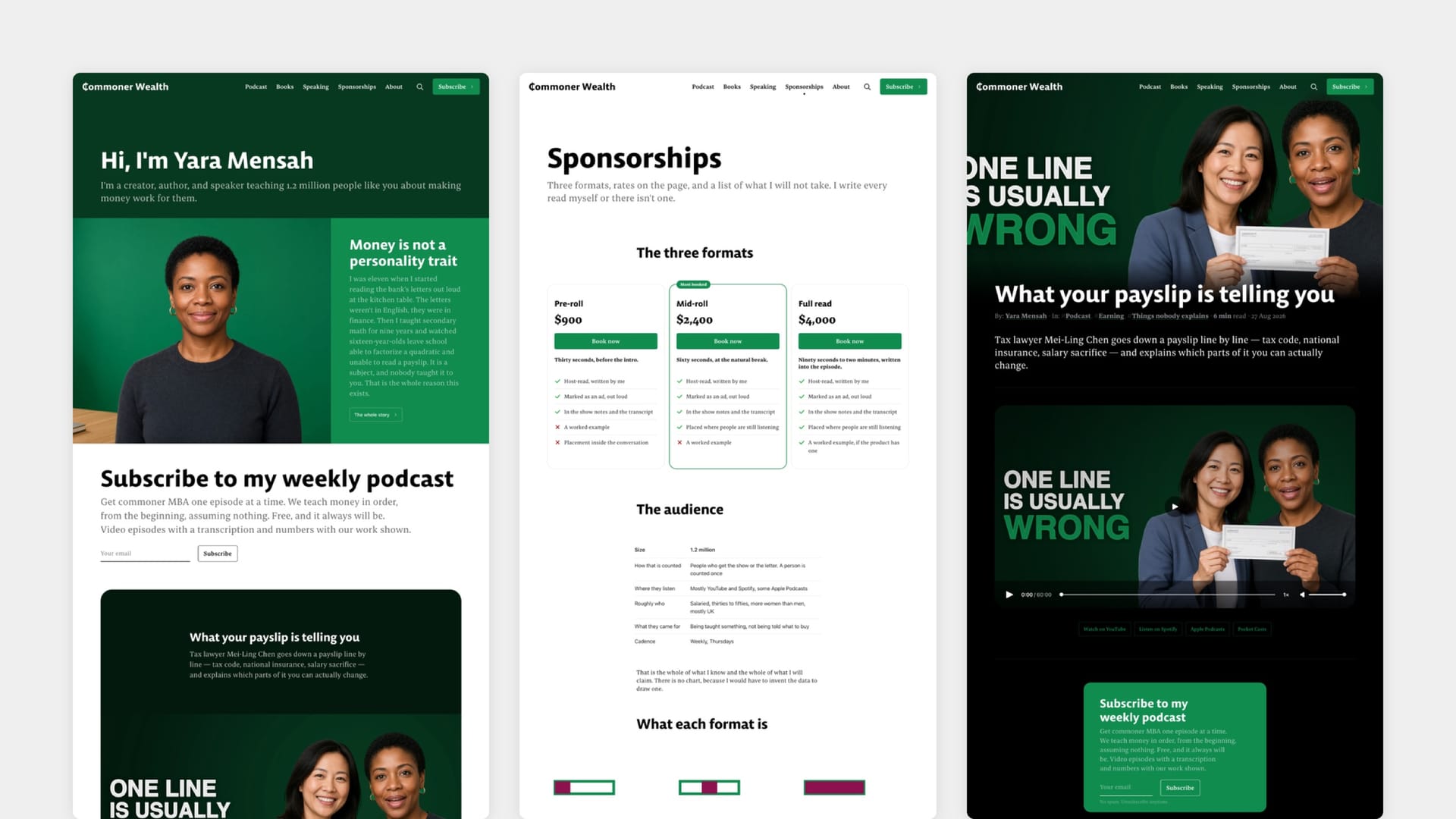
Your logo, icon and accent colour are Ghost settings, not theme settings — they live in Ghost's own branding panel and any Ghost theme reads them. Neutrino uses your accent colour for links, primary buttons, highlights and focus states, and your logo in the header.
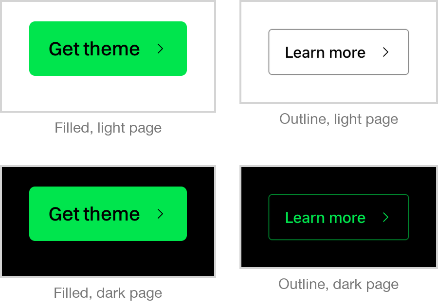
There is one thing Neutrino handles specially, and it is worth knowing before you pick a colour. An accent that is very close in lightness to the page behind it disappears where it is used as text or as an outline — a pale lime label on a white page, or a near-black one on a dark page. Rather than quietly substituting a different shade and ignoring your choice, Neutrino keeps your colour wherever it is readable and switches only those outlines and labels to black or white where it is not. Backgrounds always stay your colour.
Typography is not configurable. Neutrino ships its typefaces as part of the design and does not expose a font picker — a deliberate decision rather than an omission, since the layout's spacing and sizing are calibrated to them.