
Feature grid
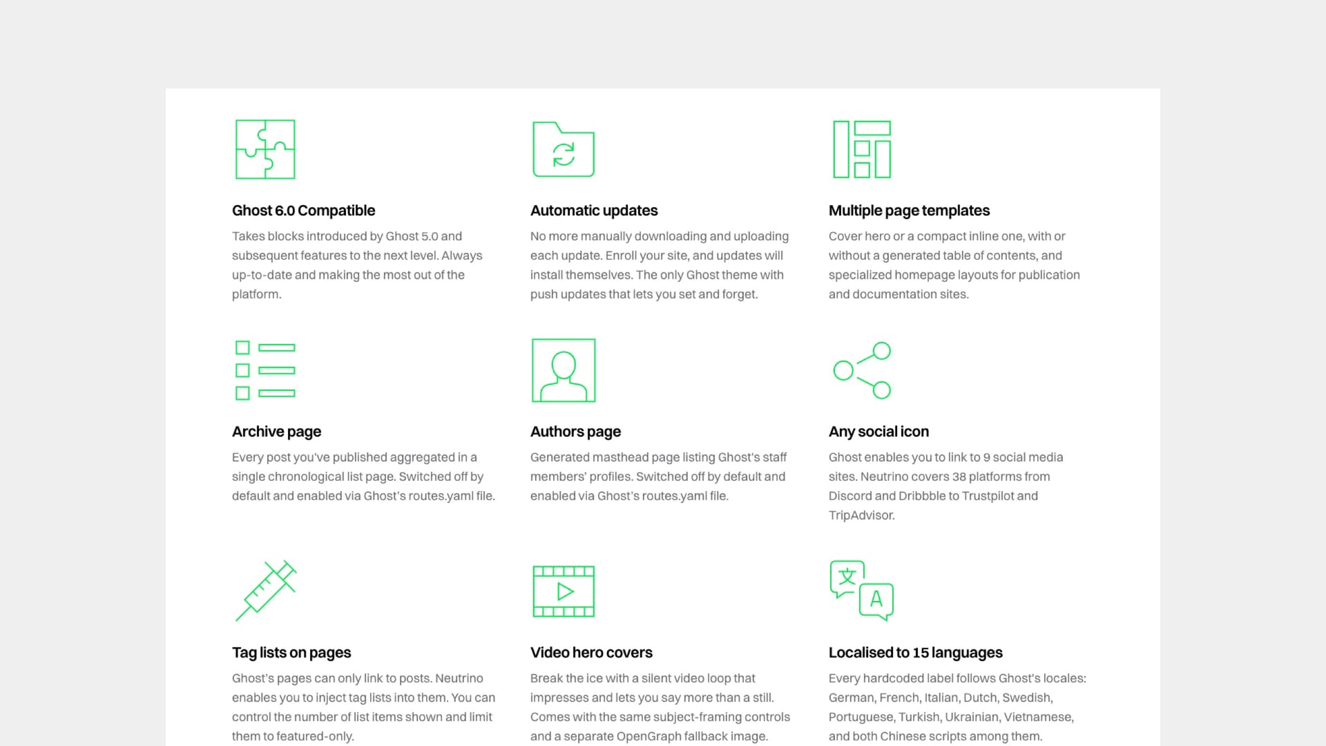
The feature grid puts a set of small features side by side — each with an icon or an image, a heading, a short description and an optional link. It is the right block for the features that matter but are not big enough to earn a full left-and-right split section each. Start-up landing pages typically carry one just below the hero.
It arranges itself. Three across on laptops and desktops, and on smaller screens whichever of three arrangements you pick — a row readers swipe through, a plain vertical list, or a strip that scrolls itself. On the three-across layout, a four-feature grid rearranges itself into a 2×2 rather than stranding one card alone on a second row; on a phone four features stack in one column like any other number.
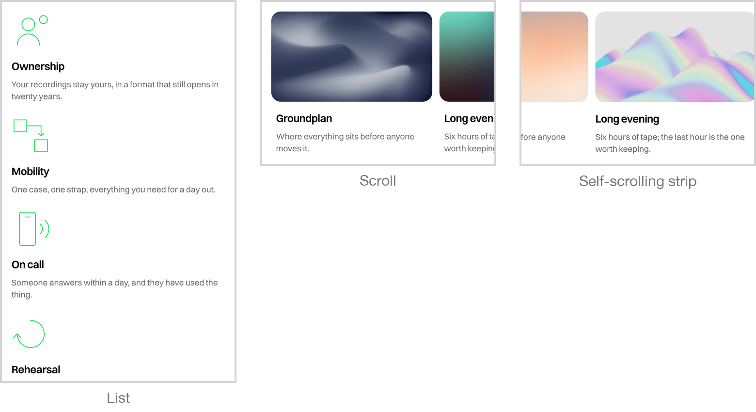
Each card decides for itself whether it is an icon or a picture, based on what you upload. A small square file renders as an icon at the size you made it; anything else renders as a full-width image cropped to a consistent shape. You can mix both in one grid, and you can override the choice for a whole grid when the automatic decision is not the one you wanted.
There is also a third look for logo strips — the "as featured in" row of press marks that belongs under a hero — which sizes every logo to the same visual weight however different their shapes are.