Hero images
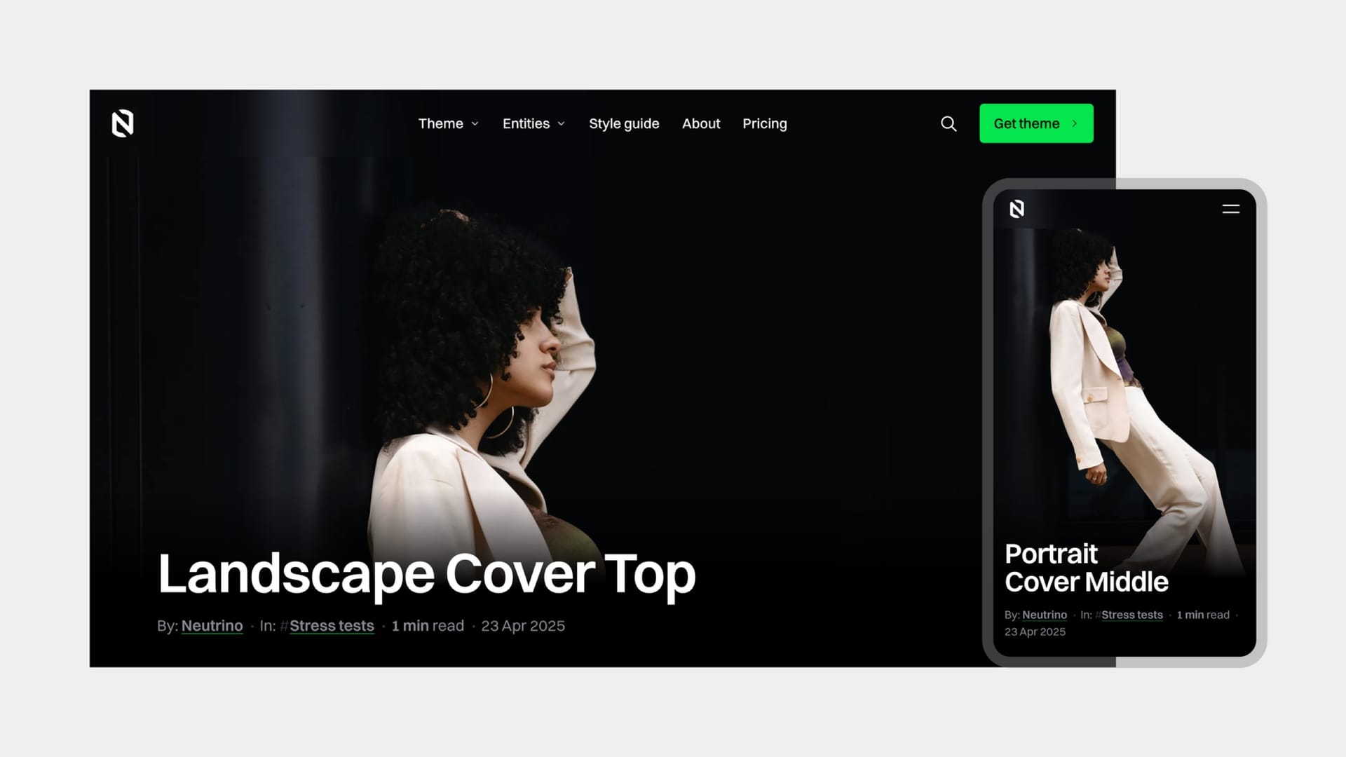
Set a feature image on a post and Neutrino turns it into a full-screen cover. The image fills the viewport, the title sits over it, and the whole composition moves as the reader scrolls — the image drifts, the text resolves into focus, and the header floats above it all, changing its own colour to stay legible against whatever is underneath.
The theme also reads your image. It picks out the dominant colour and uses it to tint the browser's own chrome on mobile, so the phone's address bar matches the photograph rather than sitting as a white band above it. Scroll past the cover and that colour hands off to your colour scheme's background.
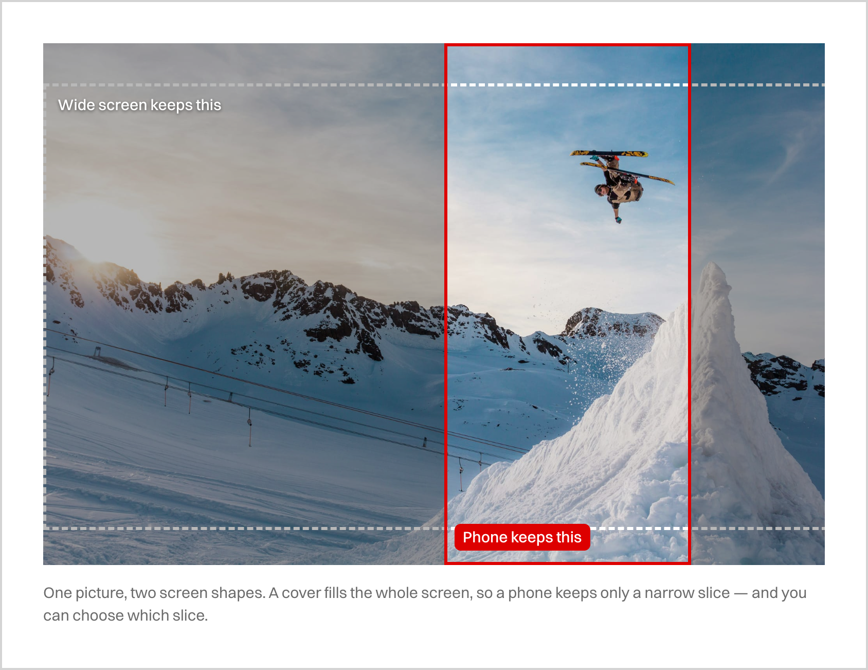
A full-screen cover has to crop your image to the shape of the reader's screen, and that shape differs enormously between a wide desktop window and a phone held upright. So Neutrino gives you per-post control over exactly which part of the image survives the crop — including different framing for landscape and portrait screens from the same file, anchoring to any edge, composing to classical proportions, fitting the whole image with no cropping at all, or shrinking it so the page background shows around it. A post with no cover is not a broken post: it collapses to a proportionally-sized title block, a deliberate typographic opening rather than an empty space.